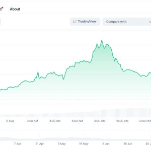
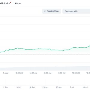
3:17 AM. The glow of three monitors is the only light in this room. Coffee’s gone cold, forgotten beside a half-eaten protein bar that tastes like sawdust. My eyes are glued to the candlestick patterns writhing on Trader Liquid Charts. That EUR/USD pair? It’s doing that thing again – coiling tight, tighter, like a spring about to snap. Liquid Charts picked up the micro-volume surge before anyone else, flashing that subtle, almost apologetic yellow alert in the corner. Saw it. Ignored it yesterday. Cost me. Tonight? Maybe I listen. Or maybe I’m just too wired to sleep, convincing myself the pixels mean something.
It’s not magic. Let’s get that straight right now. Anyone telling you a charting platform is a crystal ball is selling you swamp land. Liquid Charts feels different, though. Less like a polished sales pitch, more like… a slightly battered, incredibly observant co-pilot who chain-smokes and mutters warnings under their breath. You can choose to tune them out. Often, you probably will. But sometimes, just sometimes, that mutter saves your hide. Like last May. Luna. Remember that train wreck? Liquid’s on-chain flow indicator – this obscure little gauge buried in the ‘Advanced Metrics’ tab most people never touch – started bleeding dark red hours before the real carnage hit Binance or Coinbase Pro. It wasn’t screaming \”SELL EVERYTHING!\” It was just… persistently, unsettlingly, wrong. I saw it. Felt a cold prickle. Told myself it was a glitch, ignored the unease chasing the momentum. Yeah. We all know how that ended. Liquid Charts didn’t gloat. It just kept updating the carnage in real-time, a brutal, silent \”I told you so\” ticking across the screen.
What hooks me, what keeps me coming back even when I want to throw the whole damn setup out the window, is the liquidity mapping. God, I hate it and love it. It’s brutally honest. Most platforms show you price. Liquid Charts shows you the war zone under the price. Those heatmaps around major support/resistance? They’re not guesses. They’re aggregating order book depth from, what, twenty exchanges? Maybe more? Watching a massive buy wall suddenly evaporate on the BTC/USDT pair before the price even twitched… it’s like seeing the trapdoor open seconds before the floor falls out. Happened last Tuesday around the $28.5K zone. One minute, solid green wall holding strong on the heatmap. Next refresh? Poof. Gone. Like it was never there. Price slid through $28.4K like a hot knife through butter ten seconds later. No fancy indicators needed. Just the raw, ugly truth of where the orders actually are. Or aren’t. Makes you paranoid. Rightly so.
And the speed… Christ, the speed. Trading the NFP report last month? My old platform choked. Spun its wheels like a dying hamster. Price was already halfway to Jupiter by the time my charts caught up. Switched over to Liquid Charts mid-chaos, heart pounding, fingers slipping on the keyboard. The difference was… jarring. The tick data wasn’t just fast; it felt immediate. The lag wasn’t gone – physics is physics – but it shrunk enough that I could actually react instead of just watching the aftermath scroll by. Grabbed a scalp on GBP/USD that covered my losses from the initial lag disaster. Didn’t make me a hero. Just felt less like I was trading blindfolded.
But here’s the thing they don’t plaster on the website: it’s exhausting. Seriously. The sheer volume of data it can show you… it’s a firehose. You can drown in it. I’ve spent whole afternoons tweaking custom scripts for volume profile divergence alerts, only to realize I’ve missed a straightforward breakout pattern screaming on the main chart. The UI is… functional. Not pretty. Definitely not intuitive. Finding that one specific obscure futures contract liquidity metric feels like navigating a submarine blindfolded. Sometimes I crave the dumbed-down simplicity of TradingView’s basic setup. Just give me the damn candles and RSI. But then I see that sneaky order book imbalance building on USD/JPY, or catch a whiff of abnormal stablecoin minting flow on the ETH pair flagged by their on-chain tab, and I’m sucked right back into the data vortex. It’s a demanding mistress. High maintenance.
Customization is its superpower and its curse. Built a custom overlay combining spot CVD (Cumulative Volume Delta) with perpetual funding rates for major altcoins. Took me a weekend and three near-mental breakdowns when the scripting syntax refused to cooperate. But now? Seeing that combo flash red when funding turns excessively positive and CVD dives? It’s like an early warning siren for potential long squeezes. Saved my bacon on that last nasty SOL dump. But maintaining this stuff? Debugging it when an exchange API changes? It’s a part-time job I didn’t sign up for. Feels like I’m constantly tuning a high-performance engine just to keep it running.
The mobile app? Forget it. Trying to decipher a complex order flow chart on a 6-inch screen while juggling a coffee and dodging tourists in Shinjuku station is a recipe for disaster and spilled caffeine. It’s functional for checking basic positions or maybe setting a simple alert. But real analysis? Needs the big screens. The horsepower. The quiet (or not-so-quiet) desperation of a dedicated space. This isn’t a platform for glancing at while waiting in line. It demands attention. It demands screen real estate. It demands… commitment.
Is it worth it? On days when the market moves like molasses and I’m questioning all my life choices, staring at flickering charts that tell me nothing new, hell no. Feels like overkill. An expensive, complicated overkill. But then there are those moments. Those 3 AM moments when the noise falls away, and the data streams align, and Liquid Charts gives you that one, crucial piece of context the others missed. That glimpse behind the curtain. When you catch a whale moving stealthily through the order book heatmap, or spot the divergence between price action and genuine buying volume (CVD) before the reversal hits… that’s the hook. It doesn’t guarantee wins. Nothing does. But it feels less like gambling in the dark. More like… navigating a storm with slightly better instruments. Flawed, complex, demanding instruments that occasionally try to electrocute you. But instruments nonetheless.
Maybe I’m just justifying the sleepless nights and the eye strain. Maybe I’m addicted to the data stream. Maybe tomorrow I’ll rage-quit and go back to simple line charts. But right now, at 3:49 AM, watching that coiled EUR/USD spring finally start to unwind exactly where the liquidity pools suggested it might… yeah. For better or worse, this battered, brilliant, infuriating co-pilot stays.
【FAQ】
Q: Alright, the speed thing. Real talk: Is Liquid Charts actually faster than TradingView or MT5 for crypto? Feels like marketing hype.
A> Look, \”faster\” depends. On your internet? Your rig? The specific exchange data feed? Liquid Charts prioritizes raw speed in its architecture, especially for tick data and order book aggregation. During events like Coinbase listings or Binance futures launches, the difference in how quickly their combined feeds update versus platforms relying on slower aggregated feeds can be noticeable – think seconds versus tenths of seconds. It won\’t teleport data, but that edge exists, particularly for scalpers. Saw it myself during the last DOGE frenzy; price ticks hit Liquid noticeably before my TV window updated. Small edge, but real.
Q: Their liquidity heatmaps look insane. But how reliable is it REALLY? Can exchanges fake that order book data?
A> Can exchanges spoof order books? Absolutely. Wash trading, spoofing – it\’s the Wild West, especially on smaller crypto venues. Liquid Charts isn\’t magic. Its strength is pulling data from multiple major exchanges simultaneously and visualizing the aggregated depth. So while one exchange might have a spoofed wall, seeing consistent, deep liquidity across Binance, Kraken, and Bybit at a specific level? That carries more weight. It shows where the real concentration of orders probably is across the broader market, making isolated spoofs easier to spot as anomalies. It filters some noise, not all.
Q: I\’m drowning in indicators already. How steep is the learning curve for their custom scripting? Not a coder…
A> Steep. Let\’s not sugarcoat it. Their scripting language (Lua-based) is powerful but has quirks. It\’s not drag-and-drop. If you\’ve never coded before, expect frustration. Think days/weeks, not hours. BUT… their community forum is weirdly active and helpful (shoutout to the user \”CryptoGrump\” who saved my sanity on a volume profile script). Start small. Replicate a basic indicator you know. Steal (borrow) code snippets. It\’s a grind, but building a custom alert combining, say, funding rates with on-chain exchange netflow? That\’s unique firepower you won\’t find pre-packaged. Worth it? Depends how deep you wanna go.
Q: Mobile app is trash for analysis. Any workaround besides lugging a laptop everywhere?
A> Yeah, it\’s primarily a desktop beast. My \”workaround\”? It\’s lame but effective: I use the mobile app ONLY for critical price alerts (set those up on desktop) and maybe checking very basic positions. For any actual decision-making? I wait. Or find a cafe and fire up the laptop. Trying to interpret complex order flow or volume profile on a tiny screen is asking for a misread. It\’s a limitation. They prioritize the desktop power, and honestly? For what it does, it kinda has to. Not ideal, but you adapt.

